Saturday, April 30, 2011

Identify that Letter! Part 10: Randomization II

NOTE: All the letters, both in their uppercased and lowercased forms, have been found and collected at this point of the semester. 


This is a snapshot of a thick, blue spiral pattern of a mat that is shaped like a surfboard (the pattern probably represents a sea wave). Arguably, it resembles the form of a lowercased letter “E.” In terms of anatomy, a lowercased “E” is composed of a counter (sometimes called an eye) and a finial. Even if the spiral’s sharp interior endpoint at its center is not connected to its wavy stem, the extremity still looks like a counter. Conversely, the thick, exterior endpoint of the spiral can be considered as a finial.


This is an image of the right side of a wine opener. Whenever its handles are slightly spread, the capital letter “R” can be seen. In typeface anatomy, an uppercased “R” is formed when a vertical long stem, a slanted short stem, and an arc-shaped counter are put together (the slanted stem lies beneath the counter; both parts are on the right side of the long stem).  Along with the spread right handle and its gear-shaped connector, half of the main body of the opener must be seen in order to see the letter “R.”


This is the picture of a lobby’s coffered ceiling in a Marriott hotel.  The two rectangular boxes on the ceiling and the furrows surrounding them create the shape of a capital letter “H.” When it comes to typeface anatomy, an uppercased “H” is made out of two long vertical stems and a single horizontal crossbar (the crossbar is situated in between these stems and connects them). Ultimately, if there was no horizontal border between the boxes, the letter “H” cannot and will not be perceivable by the viewer.


This is a snapshot of a closet door’s golden doorknob. Because of its perfect circular shape and small size, it definitely resembles the form of a lowercased letter “O.” Anatomically speaking, a lowercased “O” is simply a bowl with an expansive counter; furthermore, this anatomical configuration also applies to its capital counterpart, though the only difference between the two is the size (the capital “O” is larger). Doorknobs, both large and small, with flat surfaced fronts visually make great capital and/or lowercased Os.

Tuesday, April 26, 2011

Typography, 2nd Assignment, Part 3: Chosen Drafts and Polished Final (Finished, Refined, and Digitalized)

The third and final part of the second project is now complete. There are two large rectangular boxes, both 8" x 10" each, that illustrate the heading and body texts/paragraphs in an artistic manner. As usual, like the past projects, the final digital versions done on Adobe Illustrator have been mounted on a 15" x 20" black Illustration board. Compared to the two original drafts, the digitalized versions have visually transformed.

First and foremost, the two roughs approved by the instructor:


RESULT:

Finished, refined, and digitalized version (8" x 10" rectangles mounted on a 15" x 20" Illustration board)
CLOSE-UP: Left side of the project
CLOSE-UP: Right side of the project
NOTE: The typeface Kristen ITC was applied on the texts, while Nueva Std applied on the heading.

The image on the left side portrays a collapsing pillar of texts that are about to fall down on the first phrase of the heading, Small Child. The second phrase, Big Worries, lies diagonally on top of the bent portion of the pillar of sentences. Originally, on the bottom left side of the image, the term Worries functioned as a group of charging letters carrying the word Big as if it was gigantic javelin that was meant to pierce through and take down a wall-like obstruction. Actually, this obstruction was the text itself (the paragraph). Meanwhile, the phrase Small Child was situated at the bottom right corner curling upwards. However, the most apparent modification done in the image was the shift from Landscape to Portrait page setup; after all, it is supposed to look like a page found in a magazine. The original compositions of the heading and texts in the Landscape version produced a wide, distracting and empty space on the top portion of the image.

On the other hand, the image on the right side illustrates a stack of large letters spelling out Big Worries. The phrase Small Child is placed under the tilted letter "E" of Worries. On the right side of these piled letters lies the a group floating texts arranged in a disorderly manner; the composition of the paragraph is supposed to visually relate to the composition of the stacked heading. There are several, though not too drastic, alterations that have been done on this image. First of all, although not that noticeable, the size of the letter "B" became larger. This was done so that the height of the phrase Big Worries was to exactly match the height of the box itself. Second, this phrase was slightly moved away from the edge of the left side. Third, the size of the floating texts was reduced further; they were originally large enough to take up too much space of the right side of the image. Lastly, Small Child was originally placed at the bottom left corner of the page, directly under the "G" (even the word Small was tilted downwards and positioned on top of term Child).

The final part is due tomorrow at Wednesday, April 27, 2011. There may be a formal critique for this project in class, though it is not certain when it will occur; perhaps it will take place at Monday next week (May 2).

Saturday, April 23, 2011

Identify that Letter! Part 9: Randomization


This is a snapshot of a large, rounded hourglass that was displayed at the furniture store Z-Gallerie. Visually, it is shaped like a capital letter “I.”   In terms of anatomy, an uppercased letter “I” is basically a single stem standing straightforward. Sometimes, it can be depicted as a letter with serifs on its baseline and cap height. The object’s top and bottom bulbs can be perceived as the serifs; moreover, its thin body can be identified as the stem. Indeed, it is a simplistic letter when it comes to its anatomy.


In order for this image of a toilet paper roll to be identified as a lowercased letter “B,” it must be flipped upside-down. A lowercased “B” is composed of a long stem – which in some cases has a serif on its baseline and ascender – and a bowl facing the right side.  The thick cylindrical roll can be thought of as the bowl while the unfurled sheets overhanging downwards can be distinguished as the stem (or ascender). Again, this image must be inverted or else the object will be recognized as a lowercased letter “G” instead.


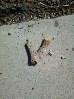
This is an image of a twig that definitely is shaped like a lowercased letter “V” (in sans serif). It should be noted that this twig was NOT deliberately severed from a tree, bush or plant; it was found in such a state at a sidewalk in front of El Camino College (southeastern side). The snapping may have occurred naturally. Anatomically speaking, a lowercased “V” consists of two slanted stems meeting at a point situated on the baseline (in other words, an overshoot). Its stems and overshoot can have serifs as well.


This is a picture of a curved, metallic handle of a drawer. It strongly resembles the shape of a lowercased letter “U.” Both a capital and lowercased letter “U” can be best described as an open loop. At times, a lowercased “U” can have a short stem attached to its right side to differentiate it from its uppercased counterpart.  Like most letters of the alphabet, this letter can also have serifs (especially its stem, if applicable). In fact, the tiny orbs on its tips/endpoints can visually be discerned as serifs.   

Friday, April 15, 2011

Typography, 2nd Assignment, Part 3: The 10 Drafts

DRAFTS (x10)


NOTE: Visualizations are NOT allowed for this part of the project.


These are the 10 drafts for the third (and final) part of the second project. Each box (approximately 8" x 10") contains a unique and artful interpretation of the heading Small Child, Big Worries. Due to the large size of these boxes, there is only one box per image. Furthermore, aside from the heading, there are the presence of several lines within a box. Each line indicates where a sentence of the paragraph(s) will be placed; like the heading, the arrangement and placement of these lines function to convey a particular message to the viewer as well. Note that the paragraph(s) are short descriptive passages concerning the social context of the heading Small Child, Big Worries.


As described on the Statement on the last post, the idea is to visually express chaos, discord, disorder, pressure, relinquishment, detachment and isolation. This is done through the vibration, squeezing, separation and random placement of letters and sentences. Every creative concept that was thought of for this part of the project heavily focuses on emotional depression.


There will be a formal critique in class on Monday, April 18, 2011. The instructor will have to choose two drafts that are to be digitalized and finished on Illustrator. Then, once finished, the digital versions will be mounted on a 15" x 20" black Illustration Board. All parts of the second project will be finished by then.

Sunday, April 10, 2011

Typography, 2nd Assignment, Part 3: The Second Statement

STATEMENT:

Depression is a serious condition in which an individual has no energy and motivation to do anything at all. In other words, it is a psychological sickness that extracts the vitality out of a person’s body. It is an amalgam of laziness, stress, and anxiety. A depressed individual without any medical treatment can be overwhelmed by insanity – if all hope is lost, self-infliction may most likely occur. In the worst case, the ultimate downfall of a depressed person is suicide. It is astonishing to find out that scientists have figured out that even infants and toddlers are capable of being in a state of depression.

The term depression is, perhaps, the most important term for the final part of the second project; there are many ways to visually interpret it. First and foremost, vibrating letters usually represent discord and chaos. Letters placed randomly and/or all over the place can insinuate disorder. The illusion of letters falling/sinking from above can symbolize the idea of giving up and letting go. Whenever letters are being squeezed together, they are visually implying pressure. On the other hand, whenever they are being separated from each other, there is a suggestion of detachment and isolation. Overall, the word depression is a term with morbid definitions. Without a doubt, it will play a key role for the heading Small Child, Big Worries (focus on social context). Like the second part of the second project, the goal is to have the phrase Big Worries overwhelm Small Child.

Two typefaces have been chosen for final part of project: Kristen ITC and Nueva Std. The typeface Kristen ITC has been implemented on the phrase Small Child. Visually, this simple typeface looks like a child’s handwriting. Like Gabriola (which was used during the second part of the project), it insinuates innocence, purity and pleasantness. On the other hand, Nueva Std can visually be linked to the horror genre. It will be implemented on the phrase Big Worries. It appears to be a typeface that can be used for horror films, posters, books, and other literary and illustrative works. Similar to Charlemagne Std Bold (another font used for the second part of the project), the typeface implies apprehension, seriousness and intimidation. By being next to each other, Kristen ITC and Nueva Std is an implication of a child being associated with depression, which was thought to be only experienced during adolescence and adulthood. 

Identify that Letter! Part 8: Can you say IKEA?


At times, decorative patterns on the surfaces of objects can turn out to be great visual representations of the letters of the English Alphabet. This is a snapshot of a fabric pattern of a pillowcase that was displayed at the famous utensil/furniture store, IKEA. Certainly, it is shaped like a lowercased letter “M.” A row of three short stems with two shoulders connecting them usually make a lowercased “M”; actually, the shoulders are positioned on top of the middle stem and are branching off of it. In some cases, serifs protrude on the top of its left spine and the bottom of its right spine. For instance, on the picture, there is a projection at the bottom of the right stem that definitely resembles a serif.


This is an image of another object that was displayed at IKEA – a simplistic, red decorative mirror frame. Actually, it is only a snapshot of a part of the entire object. The object was definitely designed to be placed in a child’s room since it is ornamented with flower-shaped décors. It strongly resembles the shape of a lowercased letter “L” in cursive. A lowercased “L” in cursive is basically a line bent into a thin loop shaped like a slanted oval; furthermore, it has two curvy, arm-like projections that are extending on both of its sides. Visually, on the left side, projection protrudes downwards. On the other hand, the projection on the right side stretches out upwards. However, the mirror frame has both of its arms extending downwards.


This is a picture of a silver swivel wheel – an object that best represents a lowercased letter “A.” Again, this is a snapshot that was taken at IKEA. A lowercased “A” is interesting because it has two forms that are slightly different from each other. One form can be best described as plain because it is only composed of a large, round bowl with a bare stem situated at the right side. The other form is a little more sophisticated: even if it has a bowl (although a smaller and less rounder one), it is attached to a stem that has a shoulder at its peak with a terminal connected to it. Moreover, the stem has a finial situated at its base. The object on the picture takes on the first, minimalistic form that was mentioned – the wheel is the bowl while its swivel is the stem.


This is a snapshot of a wooden plate holder that resembles both a capital and lowercased letter “X.” Like the others, this was an object that was displayed at IKEA. Both a capital and lowercased “X” can be best described as two slanted stems intersecting each other (one stem goes on the opposite direction compared to the other one); together, they form the shape of a cross. The main reason why this object was designated either as an uppercased or lowercased letter is because of its medium size (due to the distance between the photographer and the object). Only a medium sized object can best represent both forms of a letter if the letter's capital and lowercased forms are identical in terms of shape and appearance.

Sunday, April 3, 2011

Identify that Letter! Part 7: Lowercased Letters, Unite!


This image is a snapshot of a golden, fried and crispy calamari that can be eaten at the extravagant Japanese restaurant Ra Sushi (a sushi bar). Without a doubt, this scrumptious and delicious appetizer is shaped like a lowercased letter “C.” Visually, the letter “C” (both uppercased and lowercased) can be best described as a column with both of its upper and lower extremities bent towards the right side. The only feature that separates this dish from being identified as a capital “C” is its seemingly miniscule size. Furthermore, if memory serves correctly, its length was approximately two inches or so (though less than three inches).


This is a picture of a glazed orange soup (or tasting) spoon. This utensil can be bought from the renowned furniture/kitchen utensil store, Crate & Barrel. Apparently, it takes the shape of a lowercased letter “Q” if it is viewed from a specific angle (which is the position of the spoon on the displayed image). A lowercased “Q” is a column with an arc situated on the left side of its peak and a serif on its bottom right that protrudes upwards. Its expansive bowl must be seen from this viewpoint since its roundness strongly resembles the arc of the stated letter. Although the projection of the handle is not protruding upwards, it does look like the serif of the lowercased letter “Q.”


This chair is another object that was displayed at Crate & Barrel. It is a wooden chair with a green seat that was clearly designed to be placed at the balcony and/or backyard of a house.  By visually focusing on its seat, backrest and armrest (and ignoring its legs), these parts as a whole resemble the shape of a lowercased letter “D.” A lowercased “D” is the reflection of a lowercased “B” – it is simply a column with an arc that is positioned at the left (not right) side of its base.  However, both the armrest and the seat do not form an arc;  a long rectangle with sharp edges can be seen instead. Nevertheless, this is a visual example that shows that letters are still discernable even if their forms and parts have been altered somewhat.


This is an image of a petite faucet that is linked to a large glass jar (or vessel) that was displayed at the furniture store Z Gallerie. The object definitely resembles the form of a lowercased letter “K.”  The fact that its handle is projecting upwards and its spout downwards justifies this statement. A lowercase “K” is a long column with two protrusions that project upward and downward on the right side. Although the faucet does not have a long stem, it is identified as a lowercased letter because of its tiny size. Lowercased letters are considered to be smaller compared to their capital counterparts. Sometimes, it is the size of the object that ultimately determines whether it is either an uppercased or lowercased letter.